

What is Brand & Mortar Fest?
Brand & Mortar Fest was born from the desire to explore ideas and creatively highlight what we can do as an agency. This exercise allowed the entire agency to come together to work on a project that was limited only by our imagination, with only one goal: to show off what we can do. Afterall, it’s one thing to tell prospective clients that you can do good work, it’s another to be able to show them.
Through brainstorming sessions, we settled on the concept you see today, and Brand & Mortar Fest started to come into shape. Combining creative design and messaging, we have been building a world that you can escape to, one filled with the creative spark we tap into for each client we work with. Every element of our offering as an agency has been utilized to bring Brand & Mortar fest to life. Today, we wanted to give you a peek behind the curtain and highlight some of the process work behind the core elements of this campaign.
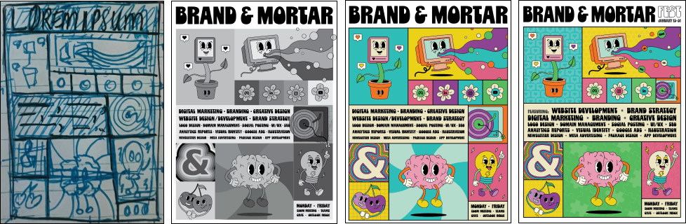
Poster Design: The Central Pillar of the Campaign
When designing the poster—the central design piece that the campaign would build upon—the goal was to push past creative comfort zones and experiment with styles not typically used in client work. The poster, designed by Sam Mollicone, reflects her unique perspective and expertise as Design Director on the Brand & Mortar team, showcasing her role in shaping the creative direction and contributing to the team’s collective vision.
The Design Process: From Paper to Digital
The team aimed to create a design featuring bold, bright colors that captured the agency’s energy and personality. The process began with researching various illustration styles and gathering inspiration, which led to the development of a unique “retro psychedelic” style. This approach fused psychedelic colors and design elements with retro character design, drawing inspiration from the 70s and adapting it to a contemporary, geometric layout.
To guide the design, the process began with compiling a mood board to set the direction, followed by sketching ideas on paper. Once a solid foundation was established, the next step was transitioning to digital tools to refine and develop the concept further. This process minimized distractions, allowing ideas to flow freely and helped overcome perfectionism, ultimately strengthening the design concept’s foundation.

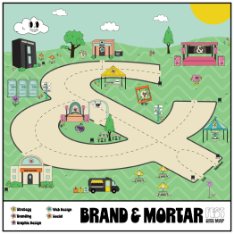
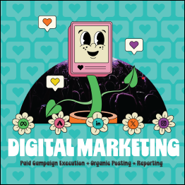
Each character in the poster was designed to represent a different facet of the agency:
Lightbulb: Creative Design
Computer: Web Development
Plant: Social Media
Cherries: Strategy
Brain: Branding

Once the sketches were finalized, the design was transferred to Adobe Illustrator, where images of the sketches were used to ensure the proportions and structure of the characters fit seamlessly within the poster’s layout. Initially, everything was designed in black and white to follow a fundamental design rule: if it doesn’t work in black and white, it won’t work in colour.